- DATE:
- AUTHOR:
- The Customer Portal team
The refreshed Xyte interface is now live!
We’ve refreshed the Xyte UI with cleaner styling, faster flows, and simpler navigation -- so you can find what you need quicker and manage devices more efficiently.
Here's what's changed:
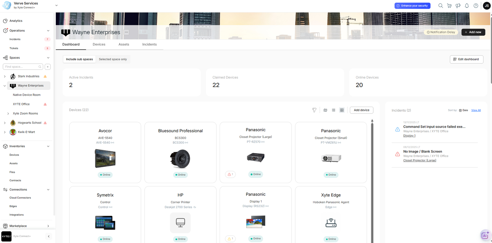
Space tree moved to the sidebar:
The space tree that was previously part of the Organization Overview is now conveniently located in the side navigation.Side navigation, simplified: (scroll down to see a close-up)
We've consolidated key areas into clearer categories, including: Operations (incidents and ticket management), Inventories (devices, assets, files, and contracts), Connections (cloud-to-cloud connectors, Edge connections, and integrations), and Marketplace (storefront, invoices, and other ecommerce-related items).Improved space view:
- Thinner header: The header is now more compact, freeing up space so you can view more of your device estate in each screen.
- New incidents tab: A dedicated Incidents tab makes it easier to spot issues quickly and take action from within the space.
- Flexible Device tab views: Choose the view that suits the task at hand best: a visual grid, a stack of device cards, or an information-rich table.Simplified top right icons:
The top navigation has been simplified to the essentials: Search, Cart, What's New, Notifications and Success Center.
Bottom line: you’ll spend less time navigating and more time managing your device estate. We're looking forward to hearing your feedback!
Please contact support@xyte.io with any questions.
